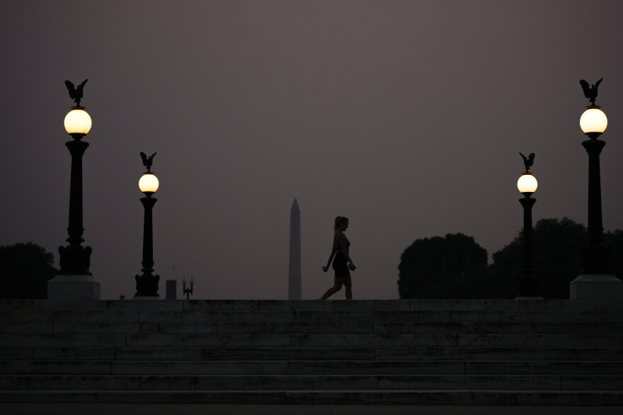
A version of this story originally ran on Feb. 5, 2021

This week, millions of Americans are anxiously scanning air quality maps focusing on two colors: red and purple. Red indicates "unhealthy" air quality, and purple? "Very unhealthy."
When did purple become the color more associated with danger?
"Red is the color of alert, of stop signs," agrees information designer Giorgia Lupi, a partner at Pentagram. But she sees the choice as logical. "Purple is the next color in the spectrum, from yellow, to orange, to red."
Lupi's job is to translate data into visual images that are easier for our minds to process. Color, for her, is a vital tool. While purple often carries positive associations in Western culture — such as sumptuousness and royalty — Lupi also points to the color's unsettling lividity. "Think of bruises, and the color purple on skin when talking about disease," she suggests. "It is another level. It's darker, and a more advanced stage, if you will."
As for how purple came to officially represent "very unhealthy" air quality: Back in the 1990s, the Environmental Protection Agency held a conference in Baltimore. There was a lot on the agenda, including a brand new, color-coded air quality index.
Loading...
Scientist Susan Stone was there, along with a number of advocates and state, local and tribal officials.
The color designation was a topic "that really blew the discussion up," Stone recalls. "They were really getting too heated. We were all saying we need to call a break because otherwise people are going to start shoving each other."
In 2021, a spokesperson from the Environmental Protection Agency offered the following history:
In developing the AQI that we have today, the most heated discussions were about colors. At a large meeting in Baltimore (in either 1997 or 1998), we took an unscheduled break during the discussion of colors because we thought attendees were going to start pushing and shoving each other. The focus was entirely around the level of the standard and the color red. Those were the days before the huge wildfires out West, so it was extremely rare to get into the Hazardous range. We mostly hit very unhealthy levels with ozone. Even though we didn't have many continuous PM monitors then, we looked back at the filter-based PM data to evaluate the number of days in different categories.
There were two factions. The environmental groups wanted red in the Unhealthy for Sensitive Groups (USG) category to show that levels were higher than the levels of the NAAQS. EPA and many of the state, local and tribal representatives wanted red in the Unhealthy category, because that's when the AQI indicates that air quality can pose a risk to everyone. We were also concerned about message fatigue. In those days, it wasn't unusual to have 30 days when ozone was above the level of the standard.
We are not sure anyone knows for certain how the final decision was made, but in the end, DC decided to go with red at the Unhealthy category. The higher colors were decided by the AQI Team to show that as air quality worsens, it can be unhealthy for some people before it's unhealthy for everyone. And even once air quality reaches unhealthy, higher levels can dictate different actions. At orange, members of sensitive groups may have effects; at red, some members of the general population may be affected, and the effects to sensitive groups may be more serious. At purple it's an alert, and the risk is increased for everyone. Maroon - hazardous - represents emergency conditions. We don't typically see that except for wildfires and occasionally, dust storms.
Stone told NPR she never suspected how often purple would be used as a color for alarm.
"Looking at the data," she says, "if we put red as 'hazardous,' it would never occur."
Now, of course, hazardous days are not uncommon, and at least in some places, the AQI is turning to an even worse color: maroon. (Black, as it turns out, is less legible on maps, and it's hard to see borders.) For now, purple continues to show how royal a mess we're in.
Copyright 2023 NPR. To see more, visit https://www.npr.org.


